
Design, Storytelling, and Identity: Reflections on Zohran Mamdani’s Campaign
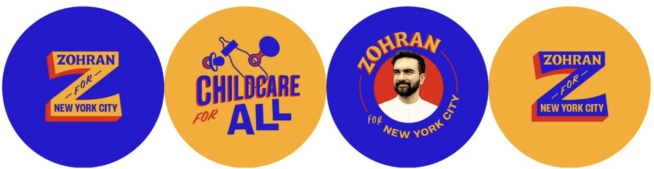
I can’t help but admire the visual language of Zohran Mamdani’s campaign and how it demonstrates the power of design in shaping stories, identity, and belonging. When I first came across the visuals, it immediately felt different from what we’re used to seeing in politics. It didn’t rely on generic patriotism or sleek corporate branding. Instead, it carried a visual warmth that felt grounded in real community life. The campaign’s design didn’t just communicate a political message. It created an emotional language that people could recognize and connect with.
The colors, textures, and typography all seemed to speak directly to New Yorkers in a tone that was familiar and human. That’s not something you often find in the visual language of politics, which can sometimes feel sterile, overly calculated, or disconnected from the people it’s meant to represent. Mamdani’s team managed to do something subtle but powerful: they designed visuals that looked like they belonged to the city and its people.
For anyone who has lived in or visited New York, the design choices instantly make sense. The colors feel warm and familiar, inspired by bodega storefronts, street signs, corner stores, and that nostalgic yellow of a MetroCard that almost everyone who’s lived in the city has held in their hands. There’s a rhythm to the palette, with yellows, reds, and soft blues that echo the energy of daily city life. It’s the kind of visual language that says, “this campaign knows where you’re from.”
But beyond that, there’s something personal and cultural woven into the design. There’s a subtle Bollywood warmth in the color tones and an echo of Indian popular culture that feels intentional. It’s not performative or overly symbolic, but it’s present in the spirit of the campaign. You can feel it in the vibrancy, in the warmth of the imagery, and in how the visuals carry a sense of familiarity that resonates with many communities who have made New York home. It’s also impossible to separate this from Mamdani’s personal background, being the son of filmmaker Mira Nair, whose own creative world has always explored identity, migration, and belonging through color, movement, and storytelling.
That connection between politics, art, and design feels natural here. It reflects how cultural influence can live in visual form, how design can quietly carry traces of family, heritage, and creative legacy. It’s a campaign that doesn’t shy away from identity. Instead, it allows identity to shape how it communicates.
As someone who grew up between cultures, this campaign resonated with me in a very personal way. There’s a deep comfort in seeing identity represented not as a marketing tool, but as an honest part of how someone tells their story. Often, people who navigate multiple cultures are asked to simplify or quiet certain aspects of themselves to fit into professional or public spaces. Here, design becomes a way to reject that flattening.
When I looked at the campaign’s visuals, I didn’t just see a political candidate. I saw a story about belonging, one that doesn’t erase complexity but invites it. It made me think about how design has the power to hold that complexity and turn it into something collective. It reminded me that design, at its best, is not about perfection or trend. It’s about reflection, about seeing who we are and how we live together.
The connection between representation and design has always fascinated me. Representation isn’t just about who is seen, but how they are seen. In visual storytelling, every color choice, every typeface, every composition carries meaning. When those choices are made with awareness, they can reshape how people see themselves in public life. In Mamdani’s campaign, representation isn’t limited to who appears in the images or who the message addresses. It’s embedded in the design language itself. The campaign doesn’t try to look like everyone else’s because the story it tells is different. It reflects a layered reality where identity is both personal and shared, where being from different places doesn’t mean being out of place.
This is what I find most moving about it. The campaign creates a visual world that feels open and inclusive without losing its roots. It reflects a multicultural reality that so many of us live every day, where the lines between home, heritage, and city life blur into one continuous experience. When design captures that fluidity, it does more than make something look beautiful. It gives people a mirror. It tells them, “you belong here too.” And in the context of politics, where belonging is often contested or narrowly defined, that is incredibly powerful.
What this campaign achieves is a reminder that identity can be a source of strength in public life. In politics, identity is often treated as something to manage or overcome. Here, it becomes something to celebrate. It adds layers of meaning instead of removing them. It invites empathy rather than creating distance. Through design, Mamdani’s campaign builds bridges between people and cultures. It makes space for warmth, humor, and everyday familiarity. It turns visual communication into a form of community care. When people see themselves reflected in the colors, in the language, in the feeling, they feel seen, respected, and part of something larger. It also challenges a long-standing tradition in political design that often centers uniformity and authority over authenticity and emotion. This campaign reminds us that good design can be political not only in message but in feeling. The feeling it leaves behind is one of connection and possibility.
In the end, what stands out most to me about Zohran Mamdani’s campaign is how effortlessly it brings together storytelling, design, and representation. It shows that political communication doesn’t need to sacrifice identity for clarity or emotion for professionalism. It proves that design rooted in culture and humanity can be just as strategic, maybe even more so, because it speaks to people’s real experiences.
For those of us who work in storytelling, media, or creative strategy, it’s a reminder that design is never neutral. Every visual choice tells a story about who we think we are and who we want to include. When that story is told with honesty and care, it has the power to move people far beyond the context of a campaign.
Seeing a political campaign that reflects lived experience, cultural identity, and community spirit so naturally feels like a shift in what political storytelling can look like. It’s not about branding. It’s about belonging. And that, I think, is the real success of this design. It reminds us that belonging itself can be designed, one color, one story, and one shared symbol at a time.
